Colour Psychology in German Kitchens: What Your Palette Says About Your Home
Colour plays a huge role in kitchen design — not just aesthetically, but emotionally. The colours you choose for your German kitchen can influence mood, energy, atmosphere and even how spacious your home feels. In Sheffield, Yorkshire and South Yorkshire, homeowners are increasingly turning to colour‑driven design to create kitchens that reflect personality, enhance comfort and elevate daily living.
At Square German Kitchens, we guide clients through a wide range of premium colour options, from calming neutrals to bold statement tones. This full-length guide explores the psychology behind modern colour palettes and how German engineering brings these shades to life with beautiful textures and finishes.
1. Why Colour Psychology Matters in the Kitchen
The kitchen is one of the most frequently used rooms in the home — and the colours you choose directly affect its mood. German kitchens offer highly customisable colour options, allowing homeowners to create the perfect emotional tone.
Colour influences:
– Warmth
– Energy levels
– Calmness
– Creativity
– Focus
– Social atmosphere
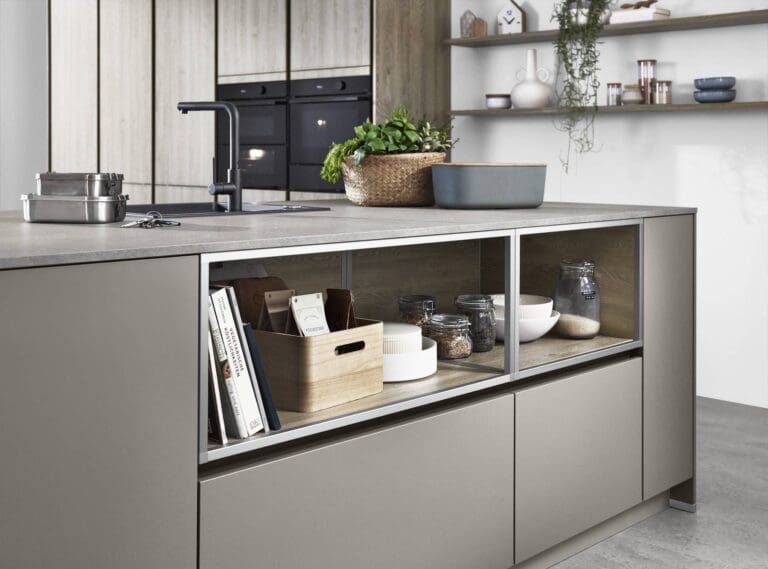
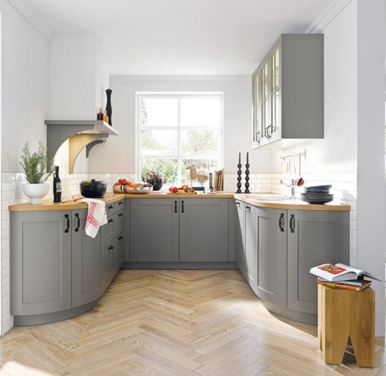
2. Neutral Tones: Calm, Timeless & Sophisticated
Neutral tones remain some of the most popular choices across Sheffield and Yorkshire homes. These include:
– Cashmere
– Stone grey
– Pebble
– Soft white
– Sand
These colours create a sense of calm, making your kitchen feel spacious, relaxing and timeless.
Neutral palettes work beautifully with German minimalist and handleless designs.
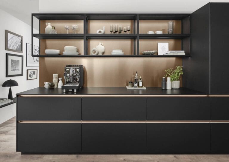
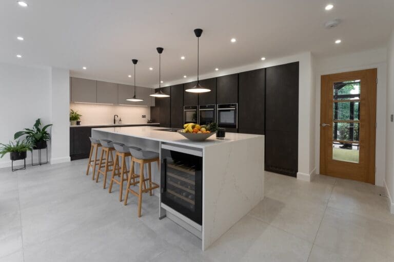
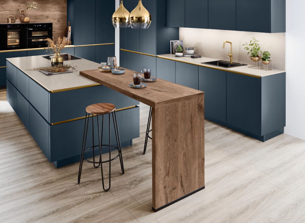
3. Rich Dark Tones: Luxury, Depth & Modern Drama
Dark kitchens are becoming a major trend in 2025. Colours like:
– Graphite
– Onyx
– Deep navy
– Forest green
– Charcoal black
These tones add depth, drama and luxury — especially when combined with wood or metallic accents.
Dark colours are often chosen for modern open‑plan Sheffield homes where lighting helps balance the mood.
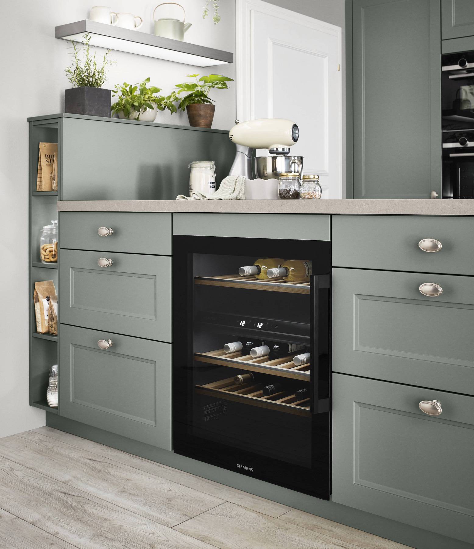
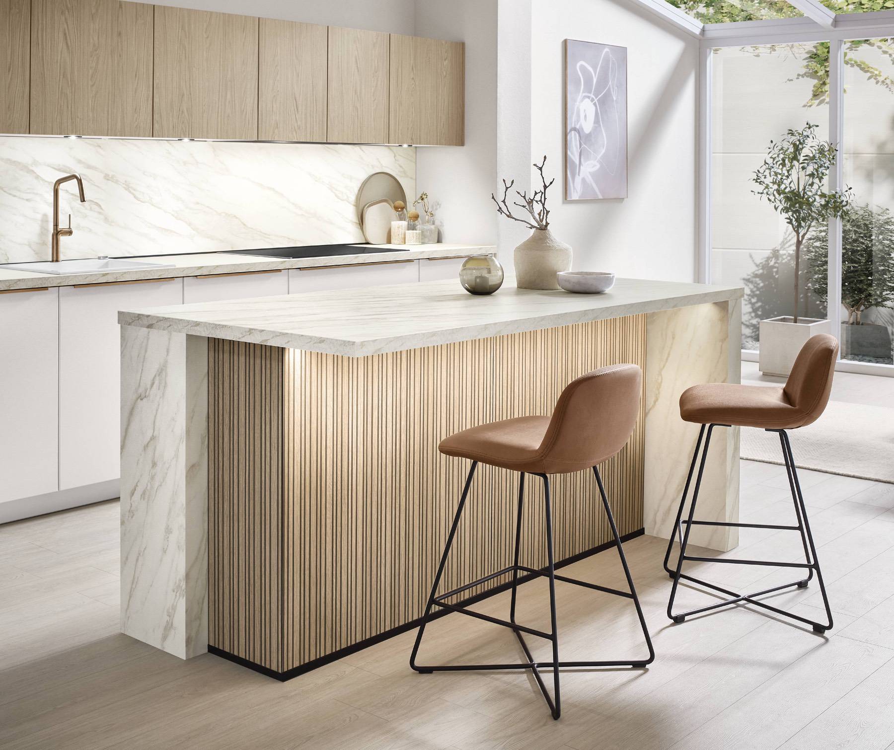
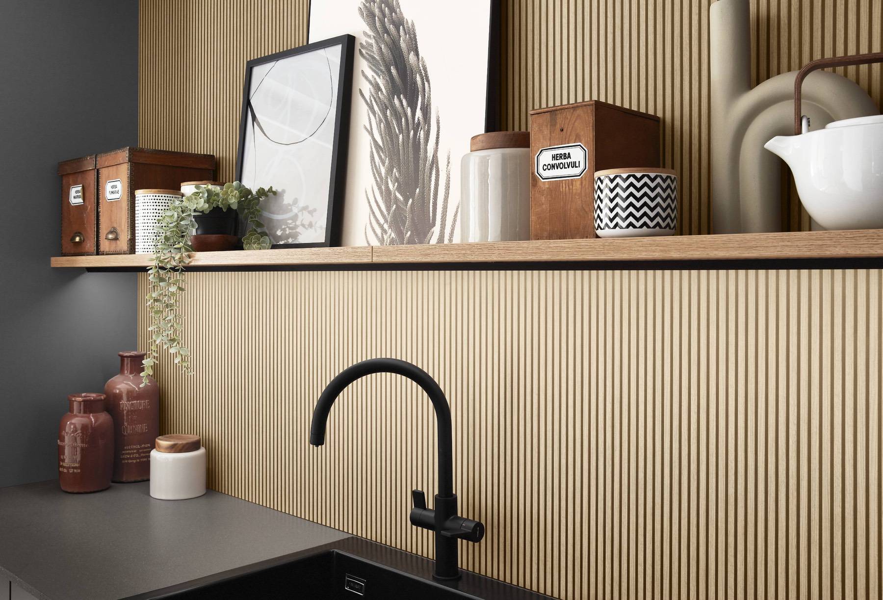
4. Warm Wood Tones: Comfort, Nature & Homeliness
Wood brings natural warmth to German kitchen design. Whether you choose oak, walnut, ash or textured laminate, wood tones feel inviting and grounded.
Wood works psychologically by:
– Reducing visual tension
– Creating warmth
– Softening minimalism
– Adding natural character
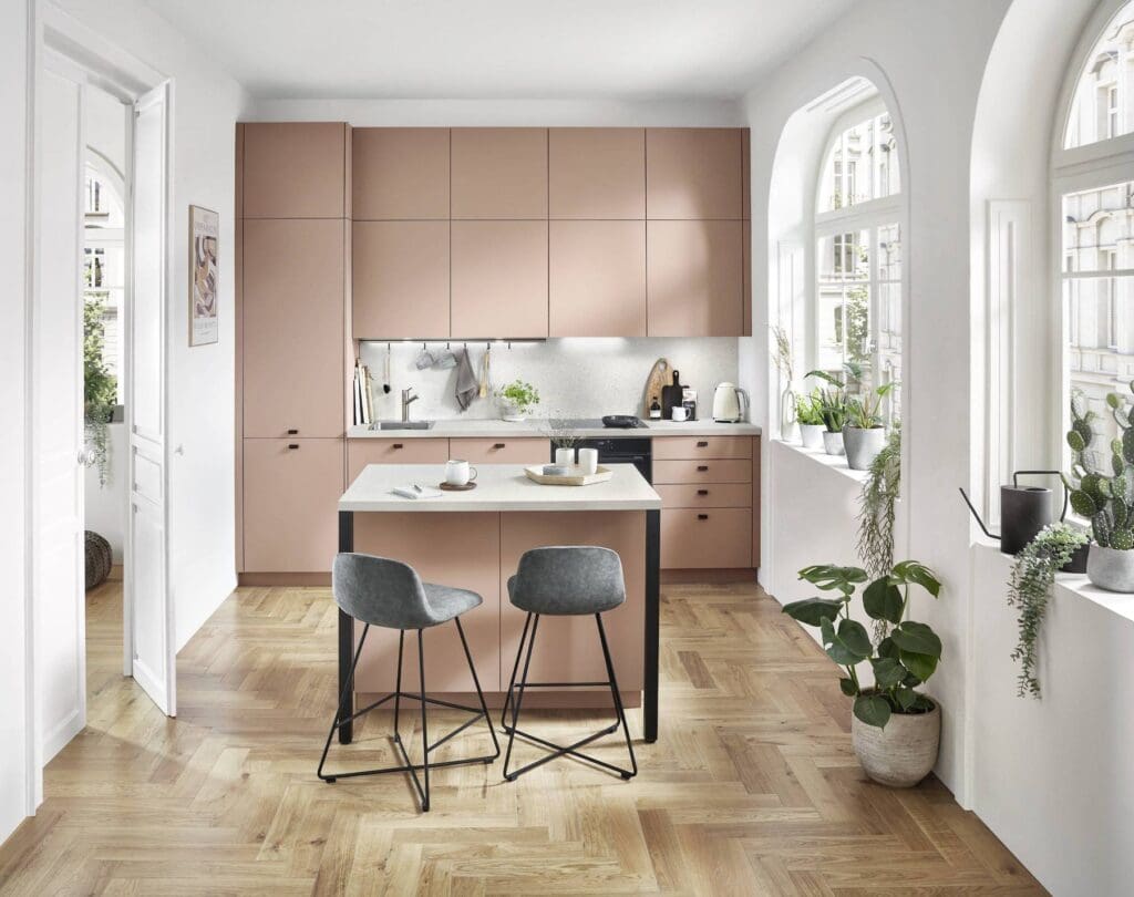
5. Pastel Shades: Soft, Modern & Refreshing
Pastels are becoming increasingly popular in modern kitchens. Shades such as:
– Sage
– Dusty pink
– Pale blue
– Light teal
These colours create a cheerful, refreshing and modern aesthetic.
Pastels pair beautifully with wood finishes and add gentle personality without overpowering the room.
6. Bold Accent Colours: Creativity, Confidence & Style
Accent colours allow you to make a statement while keeping the main palette neutral. Popular accent choices include:
– Mustard
– Burnt orange
– Turquoise
– Copper
– Burgundy
Accent colours work well in:
– Splashbacks
– Open shelving
– Feature walls
– Bar stools

7. Monochrome Palettes: Clean, Minimal & Always Stylish
Black‑and‑white palettes remain a favourite for their timeless appeal. German kitchens execute monochrome design with precision — creating sleek visual contrast and dramatic impact.
A monochrome palette creates:
– Order
– Clarity
– Minimalist impact
– Strong architectural presence
8. Creating Mood Through Texture & Finish
Colour in German kitchen design isn’t just about shade — it’s also about texture. Matte, gloss, ceramic, satin lacquer and textured laminate finishes all present colour differently.
Matte = calm, soft, premium
Gloss = bright, reflective, spacious
Ceramic = strong, architectural
Wood texture = warm, natural, inviting
German kitchens excel in colour consistency and finish quality.
9. Lighting & Colour: The Perfect Partnership
Colour and lighting work hand‑in‑hand. Smart German lighting systems allow you to adjust colour temperature and brightness to enhance your chosen palette.
Warm lighting creates comfort.
Cool lighting highlights modernity.
LED strips add depth and focus.
10. Choosing the Right Palette for Sheffield & Yorkshire Homes
Homes across Sheffield, Barnsley, Rotherham and Doncaster vary widely in style — from Victorian terraces to modern new‑builds. Your colour palette should complement your home’s architecture and natural light.
For dark rooms → lighter neutrals.
For open‑plan spaces → bold tones can work beautifully.
For north‑facing kitchens → warm wood or cashmere.
Final Thoughts
Colour is one of the most powerful design tools in your kitchen. Whether you choose soft neutrals, bold darks, warm woods or refreshing pastels, German kitchen engineering ensures every shade looks premium, consistent and beautifully finished.
At Square German Kitchens, we help homeowners and developers across Sheffield, Yorkshire and South Yorkshire create kitchens that reflect their personality while delivering unbeatable quality and performance.